Web Design Trends: Bold Fonts, Contrasting Blocks, and Negative Space
Web design is an ever-evolving landscape, with new trends emerging to shape the way we experience digital spaces. In recent years, designers have embraced a striking combination of bold, expressive fonts, big blocks with contrasting colors, and the thoughtful use of negative space. This approach not only enhances visual appeal but also improves usability and brand recognition. Let’s dive into these trends and how they’re revolutionizing modern web design.
1. The Power of Bold, Expressive Fonts
Typography has always been a crucial element of design, but today’s web designers are pushing the boundaries with oversized, attention-grabbing fonts. These bold typefaces serve multiple purposes:
Instant Impact: Large, expressive fonts make a statement right away, helping brands establish their personality and tone.
Improved Readability: When used correctly, bold fonts can enhance clarity and direct the reader’s focus to key messages.
Memorable Branding: Unique typefaces create a distinctive look that makes a website stand out.
Designers are moving away from conventional sans-serifs and experimenting with custom typography, quirky serifs, and highly stylized fonts that add character and individuality to web pages.
2. Big Blocks of Contrasting Colors
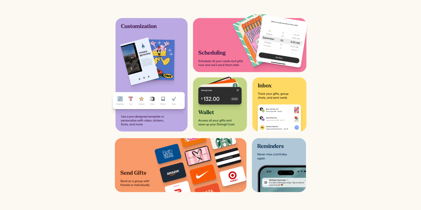
Color plays a significant role in web design, and the latest trend embraces strong, high-contrast color blocking. This approach offers several advantages:
Visual Hierarchy: Contrasting color sections guide users’ eyes through the page, making navigation more intuitive.
Increased Engagement: Vibrant color combinations grab attention and keep visitors engaged longer.
Brand Consistency: Well-chosen contrasting colors reinforce a brand’s identity and create a visually cohesive experience.
Designers are utilizing bold color blocks to separate content sections, highlight calls to action, and create a sense of energy and dynamism within layouts.
3. Embracing Negative Space
Negative space, or white space, is no longer seen as “empty” space but rather as a strategic design tool. More websites are leveraging generous negative space for:
Enhanced Readability: Adequate spacing between elements improves text legibility and content consumption.
Minimalist Aesthetic: A clean, uncluttered look makes websites feel more modern and sophisticated.
Focused Attention: White space naturally draws attention to key content, ensuring that users focus on what matters most.
This trend aligns perfectly with the rise of minimalist web design, where every element serves a purpose, and unnecessary clutter is eliminated.
—
Web design is entering an era of bold expression, where typography, color, and space work together to create immersive experiences. Whether it’s through striking fonts, vibrant color contrasts, or purposeful negative space, these trends are reshaping how brands communicate online. As we move forward, expect to see even more experimentation with these elements, pushing the boundaries of creativity and user experience.
Are you ready to refresh your website with these bold new trends? Let us know how you’re incorporating them into your design strategy!


